Work Classification: Practice

  • Božur Ivanović: Drawings

    Božur Ivanović: Drawings

    In the life of each of us there is a painting that permanently defines his understanding of art and forms his worldview. For me, that is the painting “Bunjište (Midden)” by Božur Ivanović, with which I grew up exploring its forms, questioning its meanings and rejoicing in its colours. It is a part of one, today almost unknown, exuberant painting cycle of this author, whose creative opus is for the first time shown systematically to the public through these exhibitions.

    Only a comprehensive chronological review allows us to discover the links, themes, media and poetics of Ivanović’s works, which change as a reflection of different life stages, environments and interests. After graduation, he replaced his student fascination with fresco painting for the professional restoration and copying of frescoes over the monasteries of Serbia and Macedonia. This influence is reflected in his early works of strong colours and contrasts and large formats, such as “Redenik (Bandolier)”, “Bunjište (Midden)” and “Rađanje života (The Birth of Life)”, which express the enormous energy and optimism of the young author pondering over the world and life.

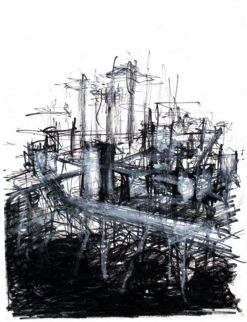
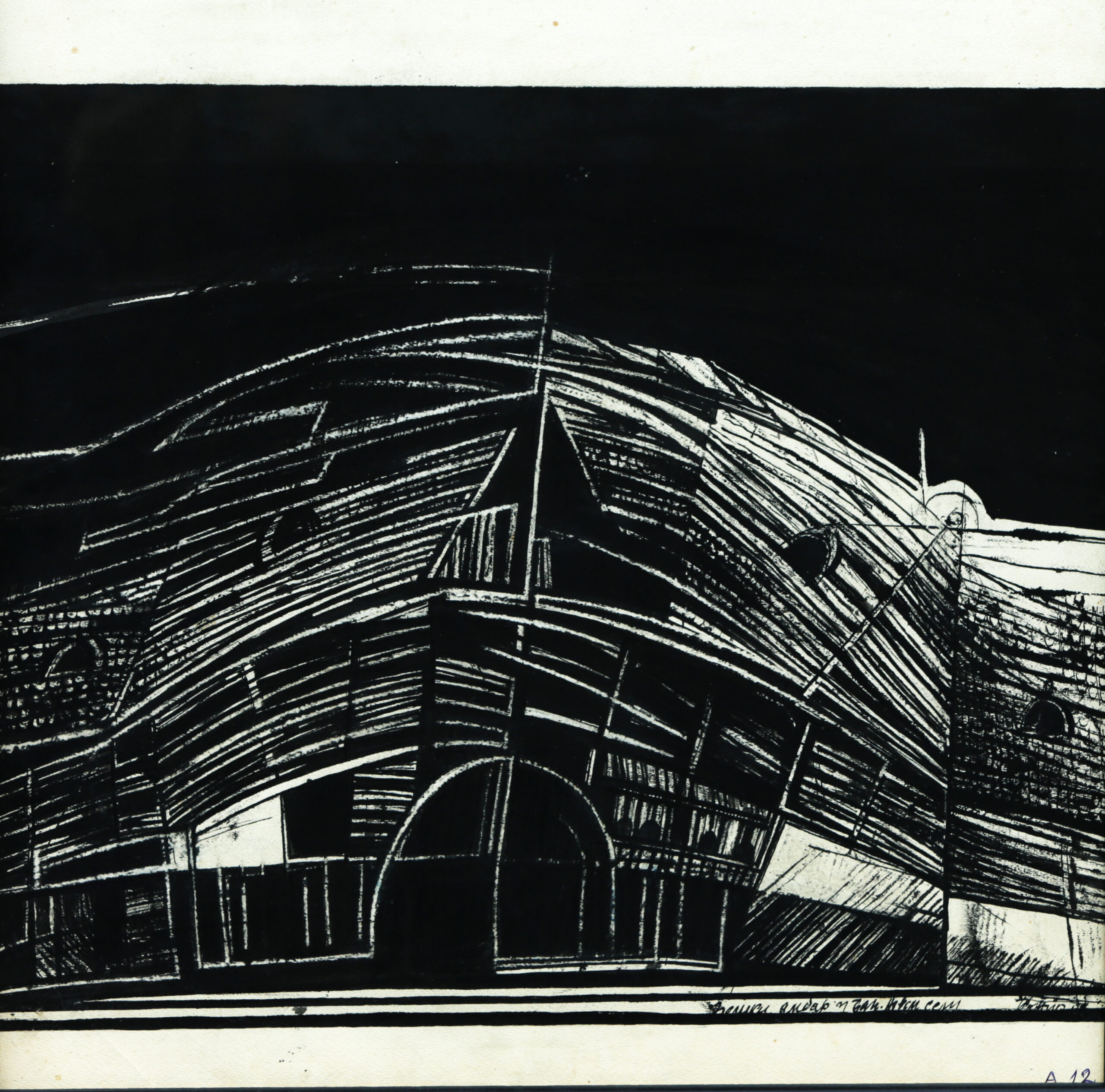
    Dedicated in the maturity to the decentralization of culture, Ivanović introduces the motives of the Banat village into the abstract figuration of his paintings, defining his most famous creative phase “Ambari (Granaries)”. In his paintings, the Pannonian fields and their rich crop overflow into the explosion of colours and shapes of the Banat granaries and barns. Full to bursting, they symbolize abundance and glorify life, floating through the endless plain with which they merge under the heavenly vault. Their spraying and deconstruction in Ivanović’s drawings in ink acquire another meaning. By distorting the forms, breaking up the elements, splitting the paper and combining techniques, the artist emphasizes the deterioration of the village, hurrying to record its beauty with a quick and confidant gesture and to invite us to its preservation and revival. This encounter of nature and civilization, spiritual and material heritage, is retained in late Ivanović’s works, in which he captures with easy strokes the Boka landscapes of his peace.

    In Ivanović’s scenography work, which includes performances “Kir Janja”, “Partija šaha (Chess Game)” and others, there are the same, recognizable artistic expression and plastic and architectural elements. This retrospective allows for that significant segment of his creation to be re-documented, interpreted and evaluated, almost half a century after it was created and awarded for its translucency and elegance.

    It is less known that Božur Ivanović, in addition to fine arts and scenography, successfully dealt with graphic design and illustrated book covers. In the 1970s and 1980s, he created the visual identity of numerous companies in Serbia, including the famous “Utva” logo, “Ratar” flour packaging that we still remember, and a series of labels for “Vršački vinogradi”, some of which are still in use. This work is not covered by the retrospective – the research on Ivanović as a designer is still ahead of us.

    Božur Ivanović belongs to perhaps the last generation of painters-bohemians, urban legends and people grand in every respect, who openly criticized the society and the system of that time, but remained in the country; who bypassed the establishment and business planning and management of their lavish talents and careers. Ivanović exhibited and was awarded at several collective exhibitions, but he was prevented from organizing solo exhibitions as a mature artist because of his political inadequacy. His works are only posthumously presented completely by the exhibition “Ambari” on the occasion of the 10th anniversary of his death at the Pavilion of the Republic of Serbia at the World Exhibition in Milan 2015 and by this retrospective in Pančevo, for which he was deeply life-related and creatively bound, in order to make them closer to the domestic and the international public, to perceive and study his opus and to recognize his contribution to Serbian art.

    Mila Nikolić (from the exhibition catalogue)
  • Tung Shing Club

    Tung Shing Club

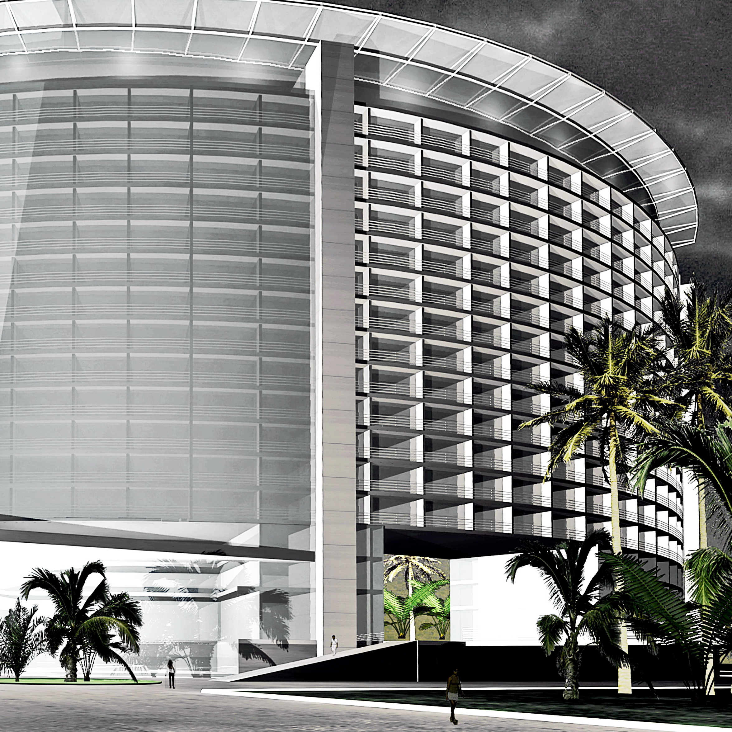
    The investor´s intention to build a new executive residential complex in the broader central district of Hanoi, in place of an abandoned shoe factory, [practically creating the high-end residential market], gave us an opportunity to study the phenomenon of the transformation of the Far East cities under the influence of dramatically changed economic conditions, initiated previously in Hong Kong, Singapore, Kuala Lumpur, Shanghai, Bangkok.

    After a long period of isolation, the major cities of Vietnam – Ho Chi Minh City (Saigon) and Hanoi – have joined this process. The “hibernation” preserved the authentic French colonial town beauty and a visible presence of all previous historic levels. The absence of planning normative and the borders of the plot as the only limitation negated completely the known methodologies, reducing the context to climatic, social and partly infrastructural aspect, and the immediate physical surrounding to a completely transformable, pulsing space. The cut in the existing lace weaving of narrow streets and humid and dark courtyards of typical Hanoi tube houses opened dilemma about the correctness of the designing act.

    On one hand, the belief in Le Corbusier´s concept of the Sun City, the universal concept of the life quality improvement, the Futurists ideas that “each generation has right to its cities”, and the need to balance the natural and the built, justified the basic principles of the project. But the feeling that this residential complex is just a part of a much wider process in which all local influences are denied, so visible in the Far East, questions again the role of the architect in the society. With the architects’ decision narrowed only to the formal aspect, and even there with severe financial constraints, we longed for “More ethics, less aesthetics”.

    Zorica Savičić

  • Pg Joan de Borbó

    Pg Joan de Borbó

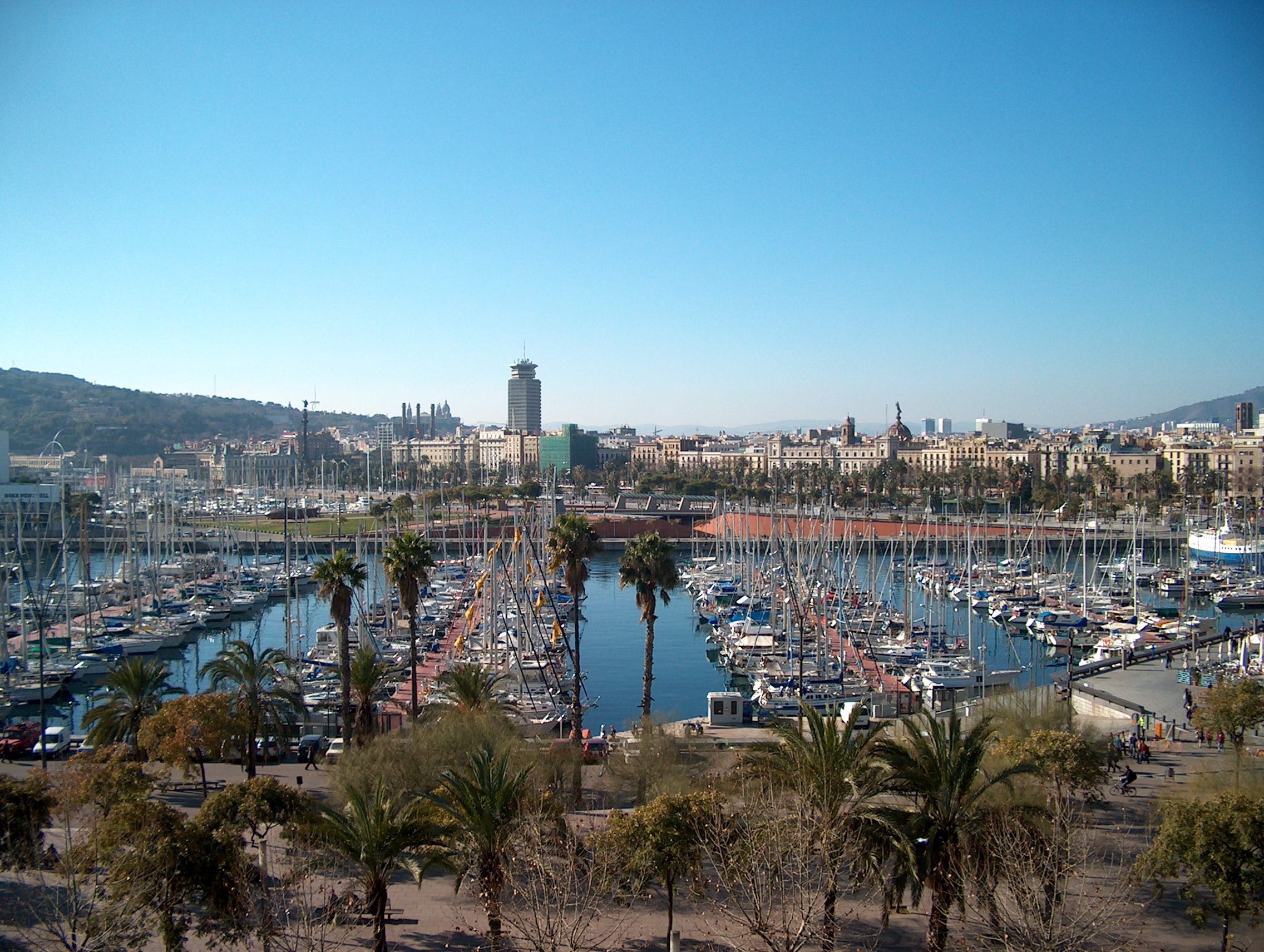
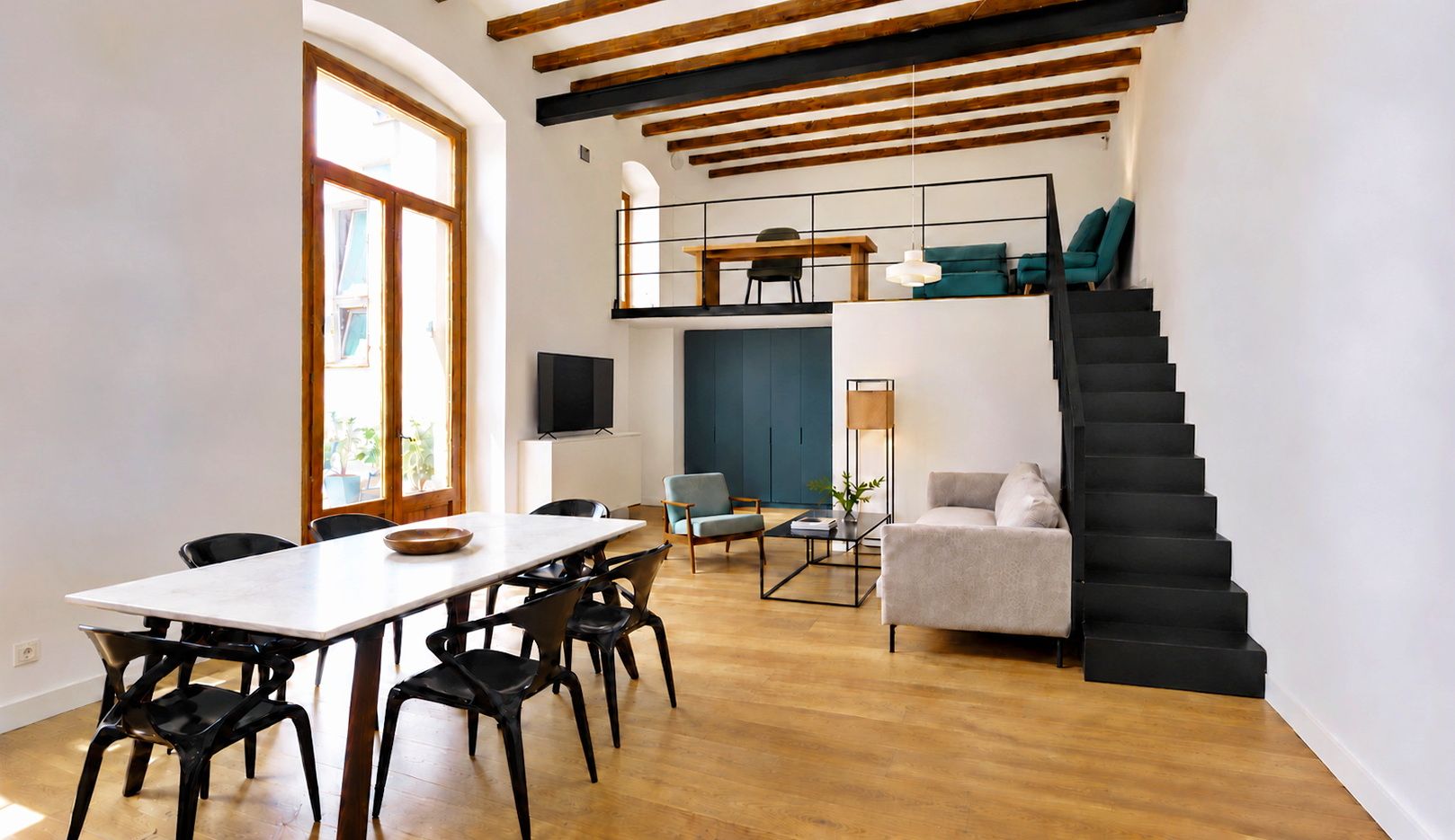
    ​This Barcelona waterfront apartment with a magnificent view was decorated within the limitations of a rented flat which make more radical interventions impossible. The original features, such as the finishings and the kitchen from 1978, were maintained and stressed using a mixture of vintage, in situ found and new furniture and contemporary art pieces and reproductions to achieve a maximal functionality and effect with minimal investment. The colour scheme moves from the bold red, black and white combination in the living room, to more contemplative oranges of the bedroom cum study and whites of the master bedroom, putting always in the first plan the spectacle of the city outside.

    ​

    ​

  • Quartier Austerlitz

    Quartier Austerlitz

    In the overall process of urban equilibration of Paris, the project TAM-TAM (comprising quarters Tolbiac, Austerlitz and Masana) brings a new prestige to the Eastern part of the city. In the last huge space to rebuild intra muros, Parisian urban planners faced a significant problem: connection of the newly built bridge Charles de Gaulle, between the Gare de Lyon and the Gare d’Austerlitz, and the future Avenue de France.

    This proposal brings back coherence to the 13th arrondissement urban matrix and to the Parisian system of public spaces. The Avenue is conceived as a multilevel and flexible system of paths and platforms, of the built and the unbuilt, open and closed, which generates green and public spaces. The presence – and thus the history – of the railway tracks that once brought city life in this peripheral zone, and today dynamize it, is preserved, symbolizing the intermodal character of Austerlitz.

  • Narcis Max Factor

    Narcis Max Factor

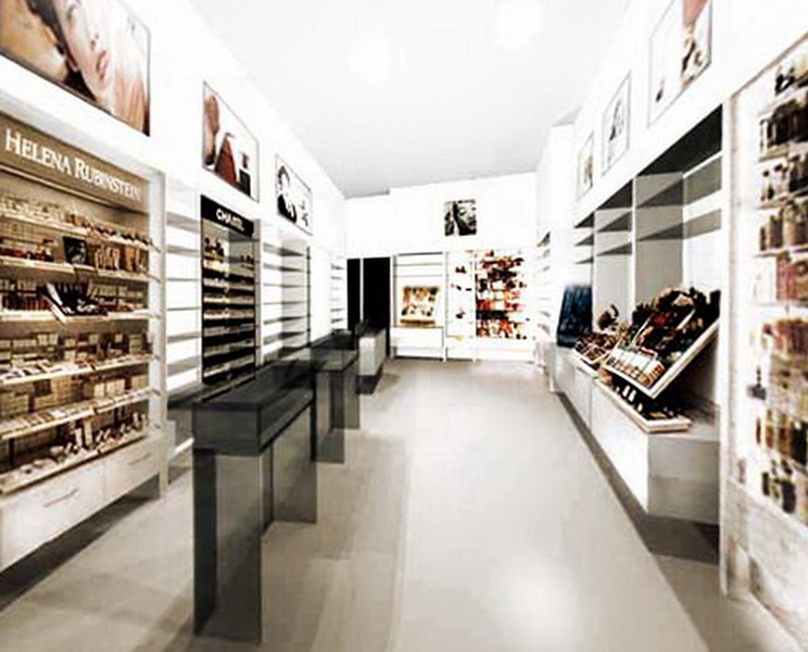
    This pilot-project proposes complete redesign for perfumeries of the chain Jasmin – Max Factor, on the best city locations, albeit worn-out in their pre-YU crisis design and furnishing. Pure lines, pure white, light and transparency move the original concept into the 21st century and create an elegant and discrete backdrop for luxury goods.

  • Radio-Pina

    Radio-Pina

    The abandoned site of the Marinha Brasilera is privileged as a natural space for expansion of the urban centre of Recife, “Brazilian Venice”, located next to the beaches Pina and Boa Viagem where commercial activities, services – mainly touristic – and housing developed during the previous twenty years. The very Radio-Pina is an island in the delta of the rivers Jordaõ and Pina, among mangroves and canals, in the immediate proximity of a fishermen’s island – Ilha de Deus, of the Aeroclub and Bacardi industry.

    The project seeks to draw over the conscious and unconscious of Recifiense, connecting the signs of the city in the water, sea, mangroves, blockhouses and man within the topics such as park, gate, favela, frontiers, emptiness, terra nova, urban environment, metro.

  • Seine Rive Gauche

    Seine Rive Gauche

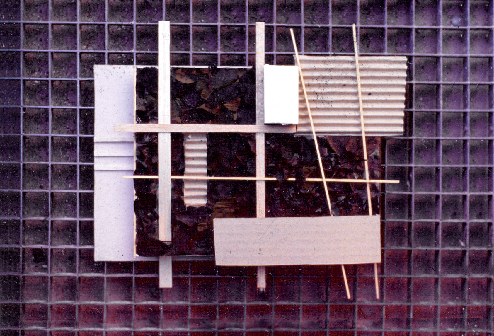
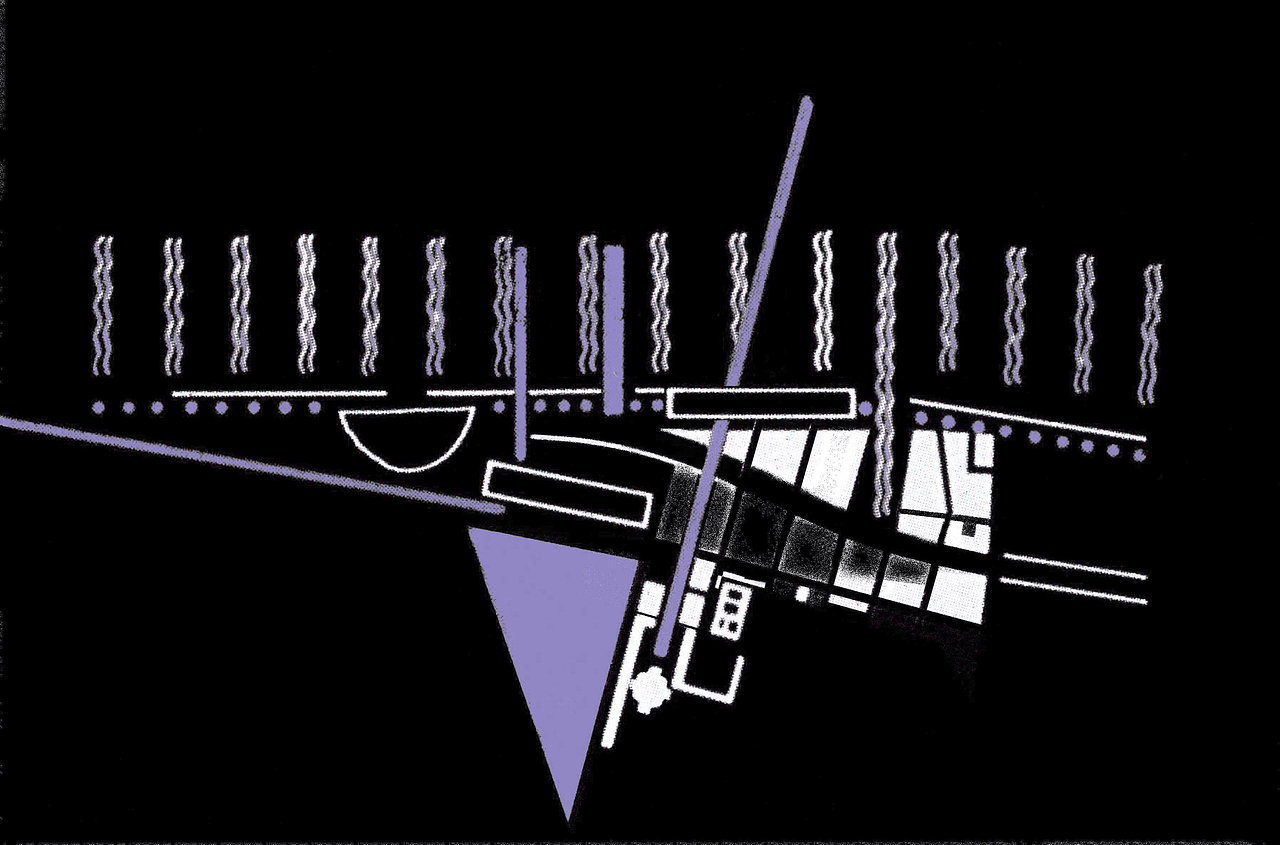
    The new urban structure aims to reconcile the existent urban matrixes developed in different époques and different coordinate systems, and to cross the networks of diverse flows, following the unwritten rule of pedestrian movement – the principle of the shortest path. The orthogonal web of the hospital complex Pitie-Salpetriere is prolonged across the rails and towards the river, its regularity accentuated by the soft curve of the new Avenue de France that follows the perimeter of the rail lira, to be merged with the Quai d’Austerlitz and the new Pont de Charles de Gaulle.

    The flows perpendicular to the Seine converge in the project in question, the Magasins généraux du port d’Austerlitz, some to enter the new cultural centre, others to cut through it to the river terraces, to the passenger boat terminal or across the river over the passarella. The proposed urban scheme sows the urban tissue cut by the railway tracks which arrive to the Gare d’Austerlitz and returns the waterfront to its hinterland, creating an urban balcony for the 13th arrondissement.

  • Polideportivo Tarrega

    Polideportivo Tarrega

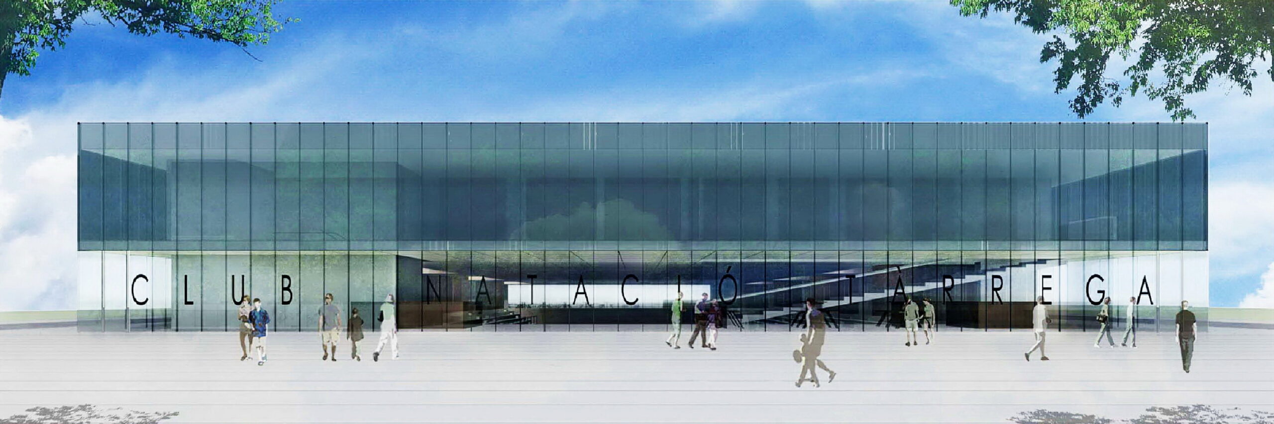
    The sports pavilion of the Club de Natacio Tàrrega creates a unity with its square as an open foyer, sheltering the main entrance for the general public and the athletes, and receiving the crush of people during sporting, theatrical and other events. A cafeteria and a restaurant, overlooking both the exterior and the game in the arena, dynamize the contact areas with the city. The transparency of the façade on the access level reinforces this relationship, showing the activities which take place within, promoting the sports, and inviting the citizens to join the club. In line with the entry of the women’s basketball team in the national league, this façade symbolizes the aspirations of the club and the city and creates the media image of Tàrrega.

    The entire building is based on a functional symmetry, adaptable to spatial needs of particular uses. Evoking the use of topography in Greek theatres, the project sinks the arena and makes the auditorium directly accessible from the street level, opting decidedly for ease in operation and clarity of orientation, crucial for public facilities of this type. The circulation system, distributed on the perimeter around the sports venue, allows different independent and simultaneous uses and users, and facilitates the arrival and rapid evacuation during the high influx of people.

    The massive roof structure integrates a natural diffuse zenithal illumination and the photovoltaic system, as well as a whole floor for additional training, fitness and social activities of the club, which maintain proximity to the entrance zone through the comfortable ramped stairs and a continuous dialogue with the square and adjoining sports complex.